Signs – the ugly kid on the block
Signs are everywhere, and like tattoos we just don’t know when to stop.
Signs. They are everywhere. Well, in New Zealand they are everywhere. Signs clutter our footpaths, signs are splattered over our shops, signs are whale carcasses that lie stranded on our railway sidings.
Many countries are worse. Visit India or China. In Africa, Coca Cola signs are more ubiquitous than wildebeest. The Japanese take signage to a whole new level, using neon with the same enthusiasm we have for sunshine. To walk the nightly streets of Tokyo is like being strapped to a Christmas tree – the cacophony of colour reminiscent of nightclub hell.
However, not all countries are signed to oblivion. England’s green and pleasant land is largely so because signage restrictions are tighter than Audrey Barlow’s pursed lips. Stroll London’s pavements while peering though the drizzle, and you will see few unnecessary signs. Victorian architecture is able to dominate Londoner’s senses without the gaudy glare of face slapping ads. Piccadilly Circus is a notable exception whereby huge signs do their best to remind us that corporations now rule the world, not Britannia. Fortunately, the neon of Piccadilly is the exception not the rule.
The problem with signs is that are an ugly distraction. They subjugate their context, reducing landscape and architecture to unimportant background – blank canvasses awaiting Dan in undies or fun in a bottle. According to advertising agencies, it pays to advertise and this is of course what drives the relentless erection of more and more signs.
But does it work? Is signage necessary, yet alone desirable?
I say no.
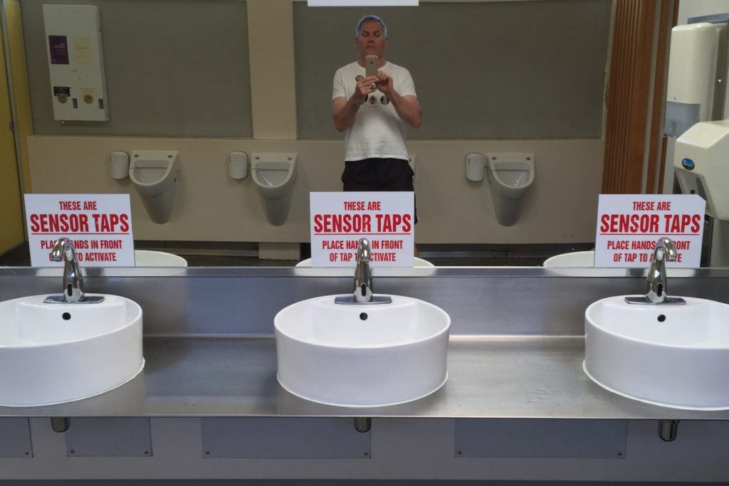
Firstly, people are not stupid. Do I need four large signs in the toilets at New Plymouth airport to tell me that the taps have sensors? (see photo). No I don’t. Is it necessary to have a giant M over McDonalds. I don’t thinks so. If you need to find a McDonalds, just follow a group of chubby schoolboys.
Secondly, the way I see it, the propensity for signage is largely based on a number of myths. These are as follows:
Myth 1: Without a sign people won’t be able to find your shop.
Myth 2: Signs are pretty.
Myth 3: Signs reflect a vibrant economy.
None of these are true. In fact, I consider the opposites to be correct. People can find buildings with discreet signs, the overwhelming majority of signs are uglier than a hungry Jeremy Clarkson, and the more signs there are, the more they reflect a desperate economy – take a look at any third world city. They can’t afford sewerage but they can afford signs for everything from Dim Sums to Samsung.
My point is that by and large, signs are an unnecessary visual curse. Yes, we need to know when to slow to 50km and it’s jolly handy to know when you have arrived in Palmerston North (so as not to be confused with Stalingrad). However, more often than not we use the subtle legibility of places to find the things we need.
Interestingly, highway signage is strictly controlled – recognition that if you over-sign it becomes less effective. Just because the butcher next door has a forecourt plastered with more signs than Muslims in Mecca, it doesn’t mean your enterprise should crack open the poster paint. Kim Kardashian has a huge bottom, but that doesn’t mean we should all have one.
Richard Alexander Bain
Self confessed sign nazi

